Tuesday 30 September 2014

Grace Poster Analysis

Image:


With the grace poster, the image chosen is relatively simple. It has a clear contrast around it which, in comparison to other horror film trailers we have analysed, is unusual. This could easily be done to show the audience that this horror film is like no other. The baby bottle used is obviously the main image on the poster; it seems to be filled with blood and a fly is on top. The image gives the first insight into what the movie is about, the baby bottle clearly shows that the film is based around a baby, and connotations around flies tend to be they are attracted to rotting objects.


Language:


There is not much language used on this poster, it has the name of the movie “Grace” at the bottom. Also at the top centre it has the words “Love Undying” . I think the pragmatics behind these words may mean, that no matter what happens, whoever you love, it is undying; meaning you shall never and should never stop loving them. And taking the thoughts based around the picture – the fly – could show that a character is rotting, that they should never be unloved. It also has the information at the bottom, which shows who the production company is and the casting directors etc.


Lighting and Colour:

This poster is relatively light in comparison to others, and there also not much colour used. The background of white really helps the blood red to stand out.  The title of the film is also in red “Grace” the semantic field of reference and connotations around this could be that there is a connection between the blood in the baby bottle and the character Grace (the baby in the film). The eerie colours that are used – distressed white and red – really help to emphasise the eerie nature of a horror movie. Not many horror movie’s poster are in lighter colours, they tend to be in dark colours and low key lighting, so this aspect really helps this poster to stand out.  

Sream Magazine Front Cover Analysis


Masthead
The masthead to the ‘Scream’ magazine is positioned at the top of the page. The font of the masthead is in bright red and the boldest point on the page, this masthead links with the theme of horror as it looks like blood as there are drips coming off each individual letter.
Image
The image used here is a head and shoulder shot of a man which we believe to be a character from the film ‘Hatchet Horror. The man has an axe covering the bottom half of his face, suggesting he has something to hide. The image of the man is also looking directly at the audience even though he does not have pupils. Around the main image there is other pictures of characters which are in other movies that the magazine is talking about, however these images are not as eye catching as the main image.

Language
The language that is used is short but snappy, drawing the audience in but not giving too much away. The language used in the tag line links with the title of the magazine front cover and it has a linked blood theme.


Tuesday 23 September 2014

Scream Magazine Front Cover Analysis


Mirrors Poster Analysis


Image

In this poster the main attention is drawn to the girl who is top centre of the poster. The main image of the girl makes it seem like she is screaming, an alternative is that she is not in fact screaming but she is having her jaw pulled down by someone or something. In this image we are also drawn to her widen eyes which can suggest that she can see something distressing or that linking to the view of having her jaw pulled that in some way she is being tortured. There is also a hint of red smeared down her face showing a feel of blood and violence.

Language
The main title is ‘Mirrors’ this is centred near the bottom of the poster. Mirrors is the biggest and boldest word we see on the poster drawing us into the name of the poster as well as the gruesome picture above. In the movie title Mirrors the letter ‘R’ is the wrong way round bringing emphasis to the fact that the film is called Mirrors. At the top of the poster is tells is that this film is directed by the same person her directed another famous film ‘The Hills Have Eyes’ this will automatically attract fans of that movie. The name of the director is placed above the name of the film which will once again attract fans from his other films. The final part of the poster that can be seen clearly and is bold is right at the bottom of the poster which is where it tells us when the film is being released.

Lighting and Colour
In this poster the image of the girl stands out clearly as the background to the poster is black as if she is emerging from the darkness behind her, there is what seems to be a light above the girls head as her forehead and checks are light bringing attention to the darkness of her eyes, then the light fades down her face until the top of her mouth. The what seems to be blood smeared across her face connects with the red of the movie title.

A Nightmare on Elm Street Film Poster Analysis


Empire Front Cover Analysis


As Above So Below trailer analysis

The trailer began with the green screen showing the appropriate age of the audience. It then moves onto the first clip, paired with dialogue from the main female character. The character has a clear English accent and has a light, happy tone, high key lighting is used in order to lighten up the mood of the film.


After the audience have a quick introduction to the female character, it straight cuts to the two production company names; Universal and Legendary.


After the production company names were presented, it showed more footage from the film. It was from this that I realised that they used the hand held camera technique, giving the impression it was a home video made by the characters.
Like the Insidious trailer, 21 seconds into the As Above So Below trailer it began to flip from scenes from the movie, to written information about the film. This helped us understand more information about the situation the characters are in.


After we have learnt more about the background of the movie, low key lighting is used as the characters enter the underground of Paris. Tension begins to build as the music gets louder; it is an eerie sound with loud beats in it at appropriate times.

  
The camera technique used by the director was mainly hand held camera. This really helped to place the audience in with the characters, making you feel like you were there. It also helped to emphasise the frantic nature of the situation when times of scares happened. The non-diegetic music begins to sound creepier and the large beats work with the jumpy scenes that are starting to happen.


Around this period in time of the movie, it gets really dark as low key lighting is used, everything gets quiet and this enables tension to build around the situation.  The scenes begin to fade from darkness to the scared characters, allowing the audience to understand the emotion around them.


We also begin to learn more about the characters background – the piano (we learn that one male had a piano when he was younger), I like this as it makes you have some form of deeper connection with the characters. Once again it straight cuts back to the production company names, in order to keep them fresh in the audiences minds.


When spoken dialogue is heard, no music is played in order for the audience to listen to what they are saying, this helps us build on the connection with the characters and fully understand the current situation.


At 1.55 in the trailer, once again the trailer flips from film scenes to information about the movie. The music is now a lot louder and there is a faster pace between clip transactions. Tension is built majorly due to this.

When the fast pace transactions have finished, there is one last scare – which is common in most horror movie trailers – and finally we are left with the name of the film. One last film clip is shown after that, and then the trailer is over.


As Above So Below is a really good film trailer and we will definitely take some of their film decisions into consideration when beginning to make our own film.

As Above So Below trailer:


Monday 22 September 2014

The Haunting in Connecticut Analysis


This screen below is seen at the beginning of every trailer that we have watched . It tells us on each different trailer beginning, who the preview has been approved for and who by.


The first shot of the trailer that we see is a bird’s eye view of what we believe to be Connecticut, this may be due to the fact that the movie title is ‘The Haunting in Connecticut’. As we see this birds eye view there is high key lighting as it is set in the day time. We get are first part of dialogue “why do bad things happen to good people” this already lets the audience see that something bad is going to happen. This first seen almost allows the audience to feel a sense of security before the scariness happens.

The setting of the trailer is carried on as we pan along a street as if we the audience are in the car with what the audience see as one of the main characters. At this part in the trailer the setting, dialogue and footage is still quite happy and upbeat. The moving footage fades out to a plain black screen with the words NORTH CONNECTICUT telling us where the trailer is linking back to the first shot where the audience believed it was set in Connecticut. This kind of effect is repeated 3 times throughout the trailer with words such as ‘BASED ON A TRUE STORY’ and when the trailer is going to be released
.


Dialogue runs throughout the beginning of the trailer as the non-diegetic voice over whilst the family are getting introduced into their new family home. Serious music is played in the background as the trailer begins, going into what sounds like a piano piece, putting the audience slightly on edge.  We then see medium fast cuts of the family sleeping in their new home, when we are cut to a view of the TV in one of the sons bedrooms in the basement, where we see someone walking away in the reflection of the TV. As this happens we have another non-diegetic sound effect which sounds like a drum as the man in the reflection walks away, the piano piece then carries on. This gives the audience more of a scare as the loud sound causes it to become more eerie.


Most of the cuts which show us the characters in the trailer are generally head and shoulder shots this allows the audience to see the facial expressions throughout the trailer. It also allows the audience to feel like part of the trailer, as the shots tend to be shot reverse shot. As we get about half way through the trailer the cuts between each scene are sped up, building on the atmosphere of the trailer and the ‘scariness’. Many of the cuts are faded between each different section. The final cut is a head and shoulder shot of the back of the main character, the music slows down and we see him looking into a door, at the end of each trailer there is a final scare for the audience, this is when we see the face of a man the other side of the glass door. When this happens once again we get a non-diegetic sound effect which makes the audience jump more. The screen then fades to a plain black screen which is followed by a shot which tells us who presents it, the producers, a website and other information is provided. Again this tends to happen at the end of each movie trailer.


Tuesday 16 September 2014

Insidious Trailer Analysis 2

The trailer started off the same as most do, with the first clip showing the movie production company, the caution information – age of audience, and website information along the bottom. The background is green, the same in every other film trailer we have watched.


After this is shown, we get a clip presenting the production company’s name, FilmDistrict, and it then goes on to show the film trailer.

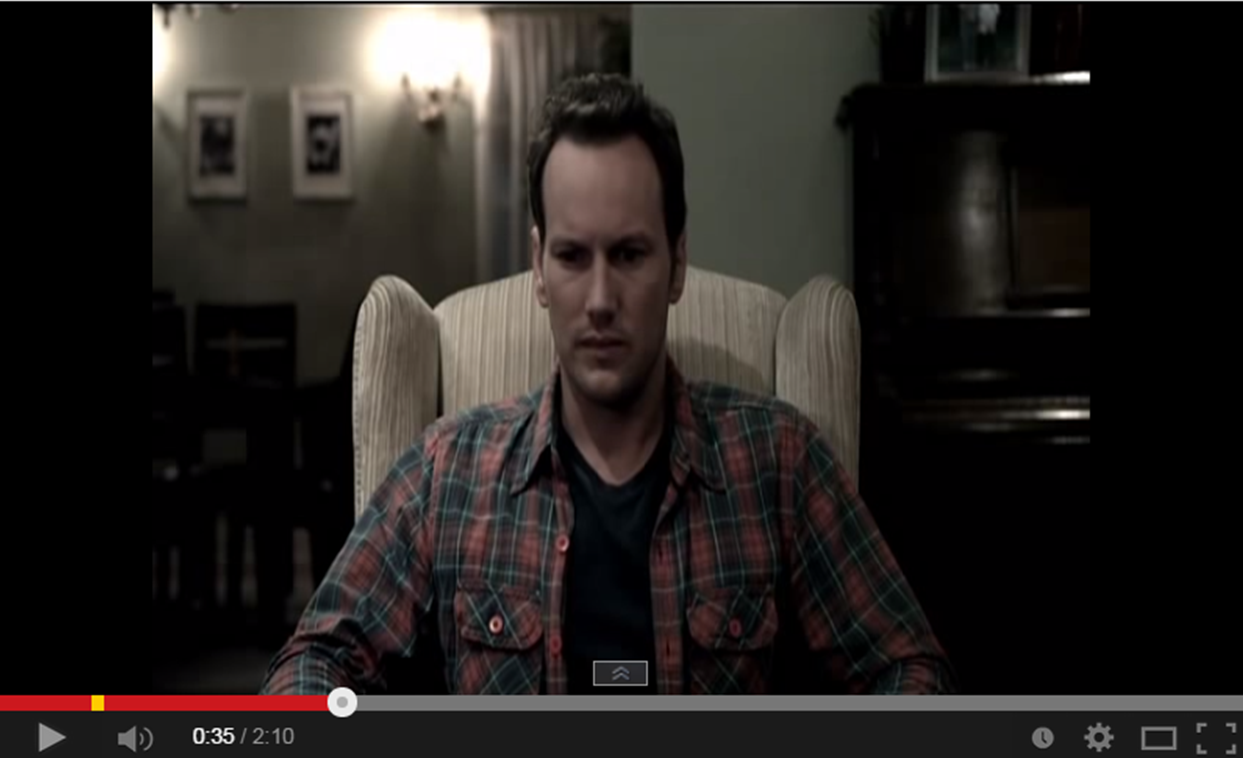
The first few seconds show the name of the movie over and over, it then goes into the first actual movie clip. It is set in a room with low key lighting, paired with odd music, giving an overall creepy vibe. The first spoken dialogue we hear is “are you ready?”, personally I really like this as although it is initially meant for the character, it could also be asked to the audience, as if asking if they’re ready for the film.

It then shows a clip of a metronome and has an emphasis on the beat, the film clips then straight cut exactly in time with the sound. It is now that the clips actually present the family in high key lighting, there is laughter and a sense of happiness around them; but the odd beat is still in the background.
Throughout the whole trailer, it constantly flips between the footage from the film and the film name – Insidious
The mood then darkens, it shows the mother worried and the young child that is ill; it is now that we get our second bit of dialogue - the mother talking about her child. After this, all music stops and it shows her walking into the boy’s bedroom where something is moving on its own. The fact there is no music builds tension upon the moving object, making it scary and putting the audience on edge.
The next few scenes really represent the paranormal side of the movie. Fast cuts between clips allow for the audience to see how many scary activities go on in the house, talking over the baby monitor and weird shadows of people who are not there.
Everything then quietens. The picture contrast gets lighter and dialogue is spoken more. It shows three new characters entering the house of the family, these characters are going to help the family, and the high key lighting used in the picture helps to represent how they are good and not bad.
Once again, pace gets faster and clips get paired with a dark, beat based music. This again builds the tension and puts scare into the audience. After a few seconds, everything stops after something scary is revealed - a red devil type figure behind the father - the trailer becomes perfectly quiet.
The quietness brings an eerie feel to the movie, and readies
the audience for something big to happen, and it does. The “bombshell” moment of the film is revealed by the voice over and once again the fast pace music starts with quick straight cuts between clips.


Just before the movie trailer ends, everything goes quiet and we are left with one big, last scare for the audience.  


The last clip shown is the one showing the casting directors and information such as that, just like the beginning screen slide, this tends to happen in most movie trailers.


Insidious Trailer:


Tuesday 9 September 2014

Insidious Trailer Analysis

Insidious Trailer Analysis
Screenshots


The first shot is of a medium shot of a male character, diegetic dialogue from presumably another character asks "Are you ready?", he replies with "Yes". Then the shot then cuts to a close up of a pendulum and it begins ticking. The diegetic sound of the pendulum is heard throughout a lot of the trailer which creates a sinister and eerie feel as if it is counting down. The pendulum could represent the time running out for the family and their child.


The next shot shows the audience that the film has been made from the makers of 'Paranormal Activity' and 'Saw', which are two very popular horror films. This could intrigue and interest the viewer. The ticking pendulum continues followed by a non-diegetic crackling noise. The font is capitalized and emboldened in the colour white which stands out on the black background. The background colour also includes hints of red which could represent blood, horror and danger, fitting in perfectly with the genre.


A medium shot shows a couple with their baby showing a happy family environment. The lighting is high key and looks like a normal family life scene. However the continued diegetic ticking sound of the pendulum in the background gives the trailer a tense feel as if there is a countdown for something sinister to happen. The family life scene aligns the audience with the characters and shows that they are the victims. The jump cuts before and after this shot also add to the countdown effect.


This shot shows the child character in a dark attic which gives the trailer a mysterious feel. The shot contrasts the previous screen shot as it has high key lighting and a happier mood. This shot also builds tension as the lighting has suddenly become darker giving the audience a warning.


This medium shot of a shadow behind the window looks like the outline of a person peering into the house. This gives the trailer a sinister and supernatural feel, as if the shadow isn't human.


This screen shot shows an over the shoulder shot of the female character looking at the baby monitor, the sound effects include whispering and shouting through the baby monitor which tells us she is not alone which gives the trailer a creepy and edgy feel. The over the shoulder shot positions the audience in the characters shoes showing her fear.

This is a long shot of a dark and spooky looking hallway, the audience will be looking straight to the bottom of the hallway intriguing them and keeping their focus on the grandfather clock. This is followed by the diegetic pendulum sound starting again and the diegetic dialogue from the paranormal investigator "Its not the house that's haunted, it's your son". This shot is followed by a series of very fast paced cuts showing close ups of the fear in different character's faces. The trailer appears to have ended but then a close up of a demon's face jumps up on screen which is there to give the audience one final scare.